This is bold and this is strong. This is italic and this is emphasized.
This is superscript text and this is subscript text.
This is underlined and this is code: for (;;) { ... }.
Finally, this is a link.
Additional Elements
Finally, here are some additional elements you might find useful (and yup, they look fine with any appearance).
Text
Headings
Heading Level 1
Heading Level 2
Heading Level 3
Heading Level 4
Heading Level 5
Heading Level 6
Heading with a Subtitle
Lorem ipsum dolor sit amet nullam id egestas urna aliquam
Nunc lacinia ante nunc ac lobortis. Interdum adipiscing gravida odio porttitor sem non mi integer non faucibus ornare mi ut ante amet placerat aliquet. Volutpat eu sed ante lacinia sapien lorem accumsan varius montes viverra nibh in adipiscing blandit tempus accumsan.
Unordered List
Default
- Lorem ipsum dolor sit amet
- Interdum adipiscing gravida odio
- Porttitor sem non integer
- Non faucibus ornare mi ut ante
- Sagittis adipiscing eleifend
- Felis amet dolore viverra
Alternate
- Lorem ipsum dolor sit amet
- Interdum adipiscing gravida odio
- Porttitor sem non integer
- Non faucibus ornare mi ut ante
- Sagittis adipiscing eleifend
- Felis amet dolore viverra
Ordered List
- Lorem ipsum dolor sit amet
- Interdum adipiscing gravida odio
- Porttitor sem non integer
- Non faucibus ornare mi ut ante
- Sagittis adipiscing eleifend
- Felis amet dolore viverra
Definition List
- Interdum adipiscing odio
-
Lorem ipsum dolor vestibulum ante ipsum primis in faucibus vestibulum. Blandit adipiscing eu felis iaculis volutpat ac adipiscing accumsan eu faucibus. Integer ac pellentesque praesent fringilla quis tincidunt felis sagittis eget tempus euismod. Ante ipsum primis vestibulum.
- Non faucibus ornare mi ut ante
-
Lorem ipsum dolor vestibulum ante ipsum primis in faucibus vestibulum. Blandit adipiscing eu felis iaculis volutpat ac adipiscing accumsan eu faucibus. Integer ac pellentesque praesent fringilla quis tincidunt felis sagittis eget tempus euismod. Ante ipsum primis vestibulum.
- Felis amet dolore viverra
-
Lorem ipsum dolor vestibulum ante ipsum primis in faucibus vestibulum. Blandit adipiscing eu felis iaculis volutpat ac adipiscing accumsan eu faucibus. Integer ac pellentesque praesent fringilla quis tincidunt felis sagittis eget tempus euismod. Ante ipsum primis vestibulum.
Blockquote
Lorem ipsum dolor vestibulum ante ipsum primis in faucibus vestibulum. Blandit adipiscing eu felis iaculis volutpat ac adipiscing accumsan eu faucibus. Integer ac pellentesque praesent fringilla quis tincidunt felis sagittis eget tempus euismod. Ante ipsum primis vestibulum.
Code
i = 0;

while (!deck.isInOrder()) {
print 'Iteration ' + i;
deck.shuffle();
i++;
}

print 'It took ' + i + ' iterations to sort the deck.';
Icons
Buttons
Actions
Form
Table
Default
| Name | Description | Price |
|---|---|---|
| Item 1 | Ante turpis integer aliquet porttitor. | 29.99 |
| Item 2 | Vis ac commodo adipiscing arcu aliquet. | 19.99 |
| Item 3 | Morbi faucibus arcu accumsan lorem. | 29.99 |
| Item 4 | Vitae integer tempus condimentum. | 19.99 |
| Item 5 | Ante turpis integer aliquet porttitor. | 29.99 |
| 100.00 | ||
Alternate
| Name | Description | Price |
|---|---|---|
| Item 1 | Ante turpis integer aliquet porttitor. | 29.99 |
| Item 2 | Vis ac commodo adipiscing arcu aliquet. | 19.99 |
| Item 3 | Morbi faucibus arcu accumsan lorem. | 29.99 |
| Item 4 | Vitae integer tempus condimentum. | 19.99 |
| Item 5 | Ante turpis integer aliquet porttitor. | 29.99 |
| 100.00 | ||
Images
Fit
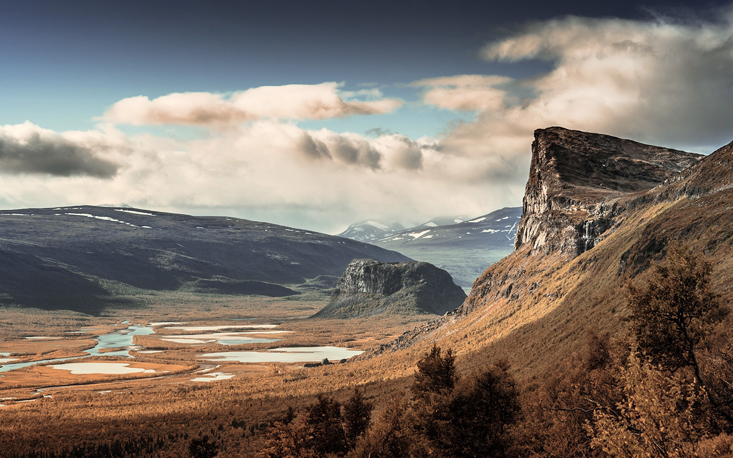
Left
 Lorem ipsum dolor sit accumsan interdum nisi, quis tincidunt felis sagittis eget. tempus euismod. Vestibulum ante ipsum primis in faucibus vestibulum. Blandit adipiscing eu felis iaculis volutpat ac adipiscing accumsan eu faucibus. Integer ac pellentesque praesent tincidunt felis sagittis eget. tempus euismod. Vestibulum ante ipsum primis sagittis eget. tempus euismod. Vestibulum ante ipsum primis in faucibus vestibulum. Blandit adipiscing eu felis iaculis volutpat ac adipiscing accumsan eu faucibus. Integer ac pellentesque praesent tincidunt felis sagittis eget. tempus euismod. Vestibulum ante ipsum primis in faucibus vestibulum. Blandit adipiscing eu felis iaculis volutpat ac adipiscing accumsan eu faucibus. Integer ac pellentesque praesent. Vestibulum ante ipsum primis in faucibus magna blandit adipiscing eu felis iaculis volutpat lorem ipsum dolor sit amet dolor consequat.
Right
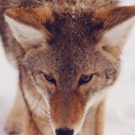 Lorem ipsum dolor sit accumsan interdum nisi, quis tincidunt felis sagittis eget. tempus euismod. Vestibulum ante ipsum primis in faucibus vestibulum. Blandit adipiscing eu felis iaculis volutpat ac adipiscing accumsan eu faucibus. Integer ac pellentesque praesent tincidunt felis sagittis eget. tempus euismod. Vestibulum ante ipsum primis sagittis eget. tempus euismod. Vestibulum ante ipsum primis in faucibus vestibulum. Blandit adipiscing eu felis iaculis volutpat ac adipiscing accumsan eu faucibus. Integer ac pellentesque praesent tincidunt felis sagittis eget. tempus euismod. Vestibulum ante ipsum primis in faucibus vestibulum. Blandit adipiscing eu felis iaculis volutpat ac adipiscing accumsan eu faucibus. Integer ac pellentesque praesent. Vestibulum ante ipsum primis in faucibus magna blandit adipiscing eu felis iaculis volutpat lorem ipsum dolor sit amet dolor consequat.
Box
Felis sagittis eget tempus primis in faucibus vestibulum. Blandit adipiscing eu felis iaculis volutpat ac adipiscing accumsan eu faucibus. Integer ac pellentesque praesent tincidunt felis sagittis eget. tempus euismod. Magna sed etiam ante ipsum primis in faucibus vestibulum. Blandit adipiscing eu ipsum primis in faucibus vestibulum. Blandit adipiscing eu felis iaculis volutpat ac adipiscing accumsan eu faucibus lorem ipsum dolor sit amet nullam.
Elements Reference
Oh, and this: a handy reference to all the modifiers supported by various elements.
Spotlight
HTML
<section class="spotlight style(N) (optional modifiers)">
<div class="content">
(content)
</div>
<div class="image">
<img src="(image URL)" alt="Alternate text" />
</div>
</section>
spotlight style1
A 30/70 (or 70/30, depending on orientation) vertical split between content and an image. Supports these modifiers:
orient-left |
Shows content on the left, image on the right. |
orient-right |
Shows content on the right, image on the left. |
content-align-left |
Left-aligns content. |
content-align-center |
Center-aligns content. |
content-align-right |
Right-aligns content. |
image-position-left |
Left-positions image. |
image-position-center |
Center-positions image. |
image-position-right |
Right-positions image. |
onload-content-fade-up |
Fades content up on page load. |
onload-content-fade-down |
Fades content down on page load. |
onload-content-fade-left |
Fades content left on page load. |
onload-content-fade-right |
Fades content right on page load. |
onload-content-fade-in |
Fades in content on page load. |
onload-image-fade-in |
Fades in image on page load. |
onscroll-content-fade-up |
Fades content up on page scroll. |
onscroll-content-fade-down |
Fades content down on page scroll. |
onscroll-content-fade-left |
Fades content left on page scroll. |
onscroll-content-fade-right |
Fades content right on page scroll. |
onscroll-content-fade-in |
Fades in content on page scroll. |
onscroll-image-fade-in |
Fades in image on page scroll. |
invert |
Inverts the color scheme. |
color1 |
Uses background color #1. |
color2 |
Uses background color #2. |
color3 |
Uses background color #3. |
color4 |
Uses background color #4. |
color5 |
Uses background color #5. |
color6 |
Uses background color #6. |
color7 |
Uses background color #7. |
spotlight style2
An image within a circular frame placed to the side of content. Supports these modifiers:
orient-left |
Places the content on the left, image on the right. |
orient-right |
Places the content on the right, image on the left. |
content-align-left |
Left-aligns content. |
content-align-center |
Center-aligns content. |
content-align-right |
Right-aligns content. |
image-position-left |
Left-positions image. |
image-position-center |
Center-positions image. |
image-position-right |
Right-positions image. |
onload-content-fade-up |
Fades content up on page load. |
onload-content-fade-down |
Fades content down on page load. |
onload-content-fade-left |
Fades content left on page load. |
onload-content-fade-right |
Fades content right on page load. |
onload-content-fade-in |
Fades in content on page load. |
onload-image-fade-up |
Fades image up on page load. |
onload-image-fade-down |
Fades image down on page load. |
onload-image-fade-left |
Fades image left on page load. |
onload-image-fade-right |
Fades image right on page load. |
onload-image-fade-in |
Fades in image on page load. |
onscroll-content-fade-up |
Fades content up on page scroll. |
onscroll-content-fade-down |
Fades content down on page scroll. |
onscroll-content-fade-left |
Fades content left on page scroll. |
onscroll-content-fade-right |
Fades content right on page scroll. |
onscroll-content-fade-in |
Fades in content on page scroll. |
onscroll-image-fade-up |
Fades image up on page scroll. |
onscroll-image-fade-down |
Fades image down on page scroll. |
onscroll-image-fade-left |
Fades image left on page scroll. |
onscroll-image-fade-right |
Fades image right on page scroll. |
onscroll-image-fade-in |
Fades in image on page scroll. |
invert |
Inverts the color scheme. |
color1 |
Uses background color #1. |
color2 |
Uses background color #2. |
color3 |
Uses background color #3. |
color4 |
Uses background color #4. |
color5 |
Uses background color #5. |
color6 |
Uses background color #6. |
color7 |
Uses background color #7. |
spotlight style3
An image within a phone-shaped frame placed to the side of content. Supports these modifiers:
orient-left |
Places the content on the left, image on the right. |
orient-right |
Places the content on the right, image on the left. |
content-align-left |
Left-aligns content. |
content-align-center |
Center-aligns content. |
content-align-right |
Right-aligns content. |
image-position-left |
Left-positions image. |
image-position-center |
Center-positions image. |
image-position-right |
Right-positions image. |
onload-content-fade-up |
Fades content up on page load. |
onload-content-fade-down |
Fades content down on page load. |
onload-content-fade-left |
Fades content left on page load. |
onload-content-fade-right |
Fades content right on page load. |
onload-content-fade-in |
Fades in content on page load. |
onload-image-fade-up |
Fades image up on page load. |
onload-image-fade-down |
Fades image down on page load. |
onload-image-fade-left |
Fades image left on page load. |
onload-image-fade-right |
Fades image right on page load. |
onload-image-fade-in |
Fades in image on page load. |
onscroll-content-fade-up |
Fades content up on page scroll. |
onscroll-content-fade-down |
Fades content down on page scroll. |
onscroll-content-fade-left |
Fades content left on page scroll. |
onscroll-content-fade-right |
Fades content right on page scroll. |
onscroll-content-fade-in |
Fades in content on page scroll. |
onscroll-image-fade-up |
Fades image up on page scroll. |
onscroll-image-fade-down |
Fades image down on page scroll. |
onscroll-image-fade-left |
Fades image left on page scroll. |
onscroll-image-fade-right |
Fades image right on page scroll. |
onscroll-image-fade-in |
Fades in image on page scroll. |
invert |
Inverts the color scheme. |
color1 |
Uses background color #1. |
color2 |
Uses background color #2. |
color3 |
Uses background color #3. |
color4 |
Uses background color #4. |
color5 |
Uses background color #5. |
color6 |
Uses background color #6. |
color7 |
Uses background color #7. |
spotlight style4
Boxed-in content set against an image background, and attached to either side of the screen or centered. Supports these modifiers:
fullscreen |
Fills the height of the screen. |
halfscreen |
Fills half the height of the screen. |
orient-left |
Attaches the content box to the left edge of the screen. |
orient-center |
Places the content box in the center of the screen. |
orient-right |
Attaches the content box to the right edge of the screen. |
content-align-left |
Left-aligns content. |
content-align-center |
Center-aligns content. |
content-align-right |
Right-aligns content. |
image-position-left |
Left-positions image. |
image-position-center |
Center-positions image. |
image-position-right |
Right-positions image. |
onload-content-fade-up |
Fades content up on page load. |
onload-content-fade-down |
Fades content down on page load. |
onload-content-fade-left |
Fades content left on page load. |
onload-content-fade-right |
Fades content right on page load. |
onload-content-fade-in |
Fades in content on page load. |
onload-image-fade-in |
Fades in image on page load. |
onscroll-content-fade-up |
Fades content up on page scroll. |
onscroll-content-fade-down |
Fades content down on page scroll. |
onscroll-content-fade-left |
Fades content left on page scroll. |
onscroll-content-fade-right |
Fades content right on page scroll. |
onscroll-content-fade-in |
Fades in content on page scroll. |
onscroll-image-fade-in |
Fades in image on page scroll. |
invert |
Inverts the color scheme. |
color1 |
Uses background color #1. |
color2 |
Uses background color #2. |
color3 |
Uses background color #3. |
color4 |
Uses background color #4. |
color5 |
Uses background color #5. |
color6 |
Uses background color #6. |
color7 |
Uses background color #7. |
spotlight style5
Boxed-in content set against an image background. Supports these modifiers:
fullscreen |
Fills the height of the screen. |
halfscreen |
Fills half the height of the screen. |
orient-left |
Places the content box on the left of the screen. |
orient-center |
Places the content box in the center of the screen. |
orient-right |
Places the content box on the right side of the screen. |
content-align-left |
Left-aligns content. |
content-align-center |
Center-aligns content. |
content-align-right |
Right-aligns content. |
image-position-left |
Left-positions image. |
image-position-center |
Center-positions image. |
image-position-right |
Right-positions image. |
onload-content-fade-up |
Fades content up on page load. |
onload-content-fade-down |
Fades content down on page load. |
onload-content-fade-left |
Fades content left on page load. |
onload-content-fade-right |
Fades content right on page load. |
onload-content-fade-in |
Fades in content on page load. |
onload-image-fade-in |
Fades in image on page load. |
onscroll-content-fade-up |
Fades content up on page scroll. |
onscroll-content-fade-down |
Fades content down on page scroll. |
onscroll-content-fade-left |
Fades content left on page scroll. |
onscroll-content-fade-right |
Fades content right on page scroll. |
onscroll-content-fade-in |
Fades in content on page scroll. |
onscroll-image-fade-in |
Fades in image on page scroll. |
invert |
Inverts the color scheme. |
color1 |
Uses background color #1. |
color2 |
Uses background color #2. |
color3 |
Uses background color #3. |
color4 |
Uses background color #4. |
color5 |
Uses background color #5. |
color6 |
Uses background color #6. |
color7 |
Uses background color #7. |
Gallery
HTML
<div class="gallery style(N) (optional modifiers)">
<article>
<a href="(full image URL)" class="image">
  <img src="(thumbnail image URL)" alt="Alternate text" />
</a>
<div class="caption">
  (caption)
</div>
</article>
<article>
<a href="(full image URL)" class="image">
  <img src="(thumbnail image URL)" alt="Alternate text" />
</a>
<div class="caption">
  (caption)
</div>
</article>
<article>
<a href="(full image URL)" class="image">
  <img src="(thumbnail image URL)" alt="Alternate text" />
</a>
<div class="caption">
  (caption)
</div>
</article>
...
</div>
gallery style1
A grid of thumbnails with optional lightbox support. Supports these modifiers:
small |
Uses small thumbnails. |
medium |
Uses medium thumbnails. |
big |
Uses big thumbnails. |
lightbox |
Enables lightbox behavior. |
onload-fade-in |
Fades in thumbnails on page load. |
onscroll-fade-in |
Fades in thumbnails on page scroll. |
gallery style2
A carousel of thumbnails with optional lightbox support. Supports these modifiers:
small |
Uses small thumbnails. |
medium |
Uses medium thumbnails. |
big |
Uses big thumbnails. |
lightbox |
Enables lightbox behavior. |
onload-fade-in |
Fades in thumbnails on page load. |
onscroll-fade-in |
Fades in thumbnails on page scroll. |
Items
HTML
<div class="items style(N) (size modifier) (optional modifiers)">
<section>
(content)
</section>
<section>
(content)
</section>
<section>
(content)
</section>
<section>
(content)
</section>
...
</div>
items style1
A grid of items separated by borders.
small |
Uses small items. |
medium |
Uses medium items. |
big |
Uses big items. |
onload-fade-in |
Fades in items on page load. |
onscroll-fade-in |
Fades in items on page scroll. |
items style2
An outlined grid of items separated by borders.
small |
Uses small items. |
medium |
Uses medium items. |
big |
Uses big items. |
onload-fade-in |
Fades in items on page load. |
onscroll-fade-in |
Fades in items on page scroll. |
items style3
A borderless grid of items.
small |
Uses small items. |
medium |
Uses medium items. |
big |
Uses big items. |
onload-fade-in |
Fades in items on page load. |
onscroll-fade-in |
Fades in items on page scroll. |
Wrapper
HTML
<div class="wrapper (optional modifiers)">
(content)
</div>
Modifiers
invert |
Inverts the color scheme. |
color1 |
Uses background color #1. |
color2 |
Uses background color #2. |
color3 |
Uses background color #3. |
color4 |
Uses background color #4. |
color5 |
Uses background color #5. |
color6 |
Uses background color #6. |
color7 |
Uses background color #7. |